Selecting Data Ranges
There are several different ways of selecting data ranges, and this guide will take you through the fundamentals of following methods.
- Range Highlighting Through Graphs/Track Map
- Range Highlighting Through Tables
In all the following examples, only four windows will be shown, the XY Graph, the Summary Statistics, the Lap And Sector Times and the Track Map.
Range Highlighting Through Graphs/Track Map
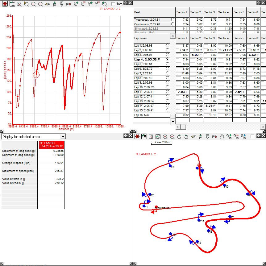
Highlighting through an XY Graph or Track Map allows you to select one or multiple ranges. To highlight on either, you need to hold down shift, and click and drag to highlight a sector:
Note that the corresponding range on the XY Graph has been highlighted, and also that the summary statistics now displays data for the highlighted area. Also note that even though the highlighted section overlaps Sector 5 to 9, it is not highlighted on the Lap And Sector Times table. The results are the same if you select an area on the graph through the same method.
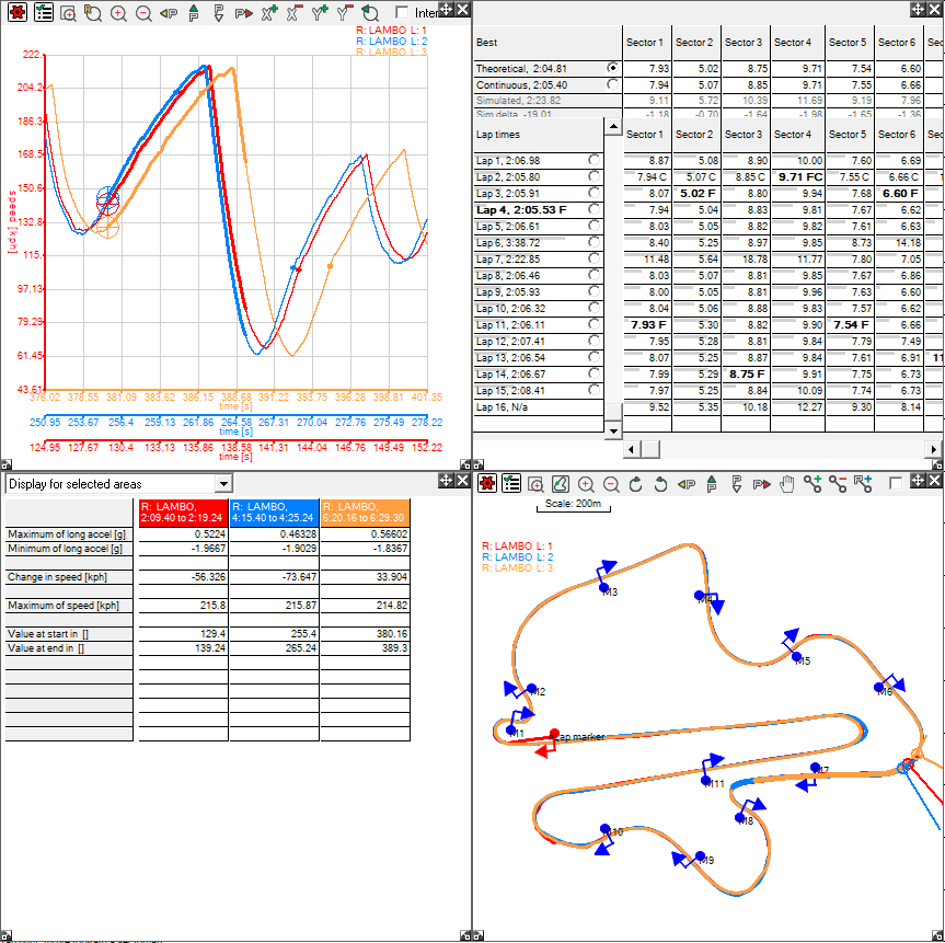
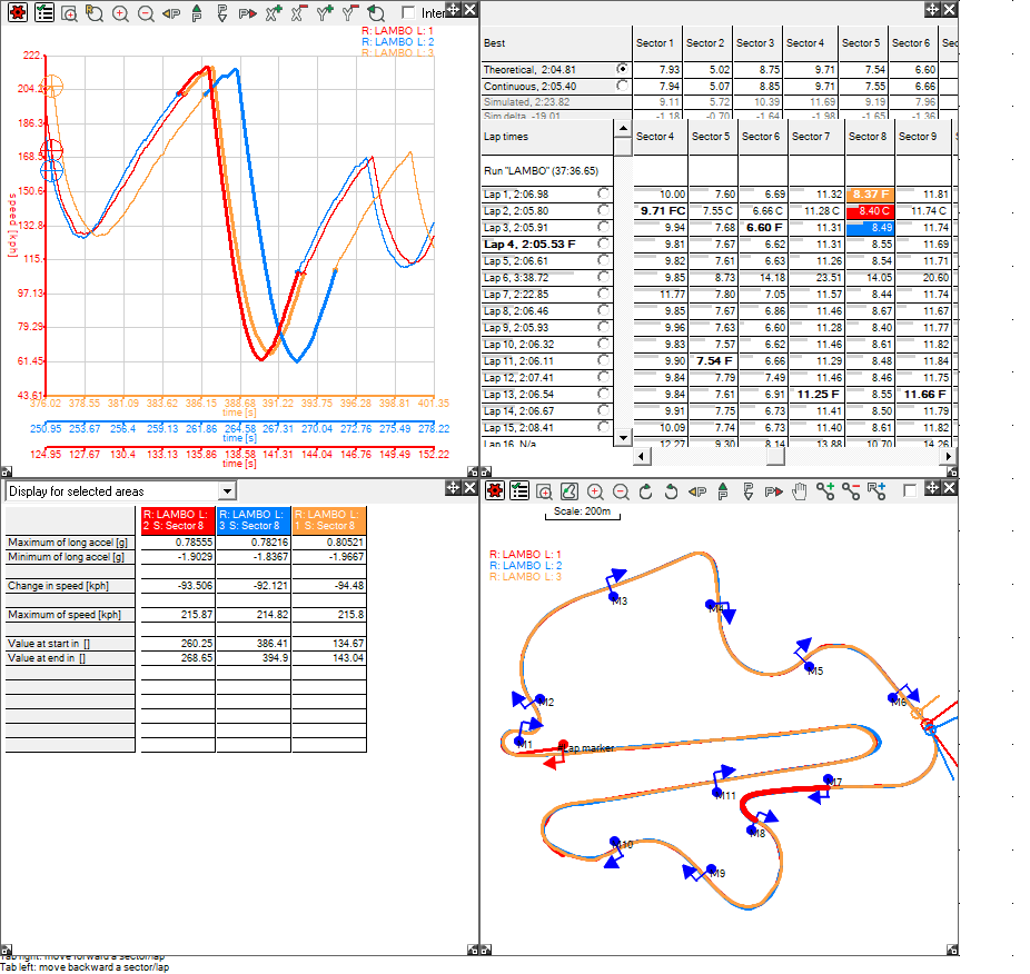
The above example only dealt with highlighting one section. There is no change in the method for highlighting multiple ranges, i.e. from multiple laps or runs, but the set up for the windows do have to change. Set up the XY Graph and Track Map to display multiple traces, then follow the same method:
Note that the Summary Statistics now displays data for all the highlighted ranges. As this data was selected on the track map, the relative data has been shown on the XY Graph. As the second lap was slower to start, then the highlighted section is at a later time relative to the start of the lap.
Range Highlighting Through Tables
To highlight from a table, simply click on the cell you want to look at from the table, and the associated data will be displayed on the other windows open. This first example is from the Lap And Sector Times table:
Note that the sector has been highlighted on the Track Map and the sector with the relative times has been highlighted on the XY Graph. For this example only the lap that is being looked at has been displayed.
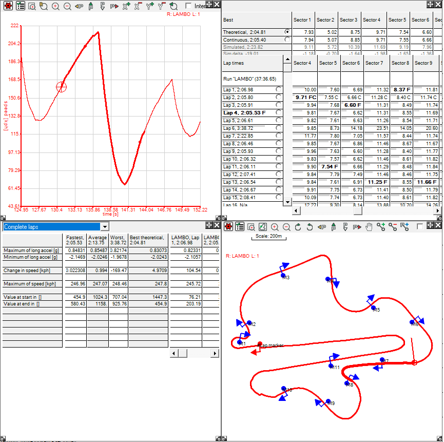
This second example is from the Summary Statistics table. Please note that the data shown has been selected as "Complete Laps":
Please note that in this case, the fastest lap is the same as the fourth lap in this case. The Summary Statistics window will display data for all laps for all runs, although the window must be enlarged to see these.
You can highlight multiple ranges on all the tables that you can highlight data on. Please note that on the Lap And Sector Times table and the Marker Based Measurements you an only select multiple ranges from the same column. In these examples, once again, the XY Graph and Track Map have been set to show multiple traces.
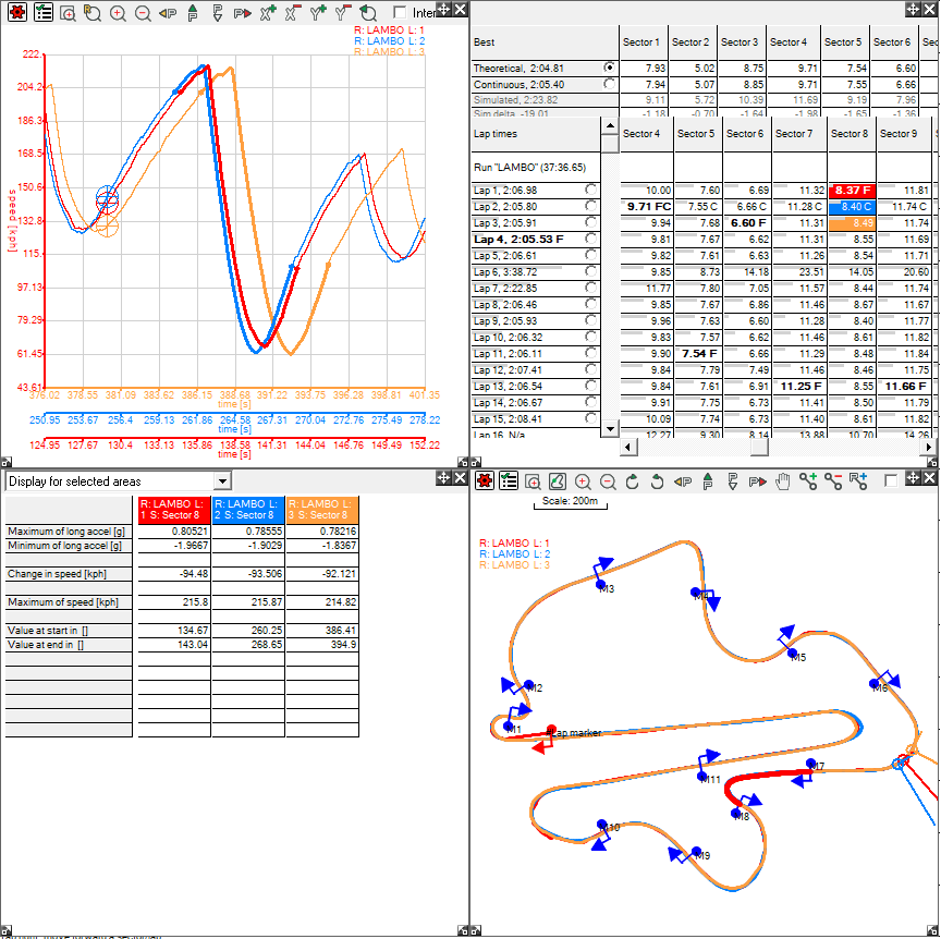
Firstly, to select multiple ranges on the Lap And Sector Times table, you can click on several cells in the same column to compare them against each other:
Note that the traces and cells are colour co-ordinated. You can adjust these colours to your own preferences, to learn how to do so, click here.
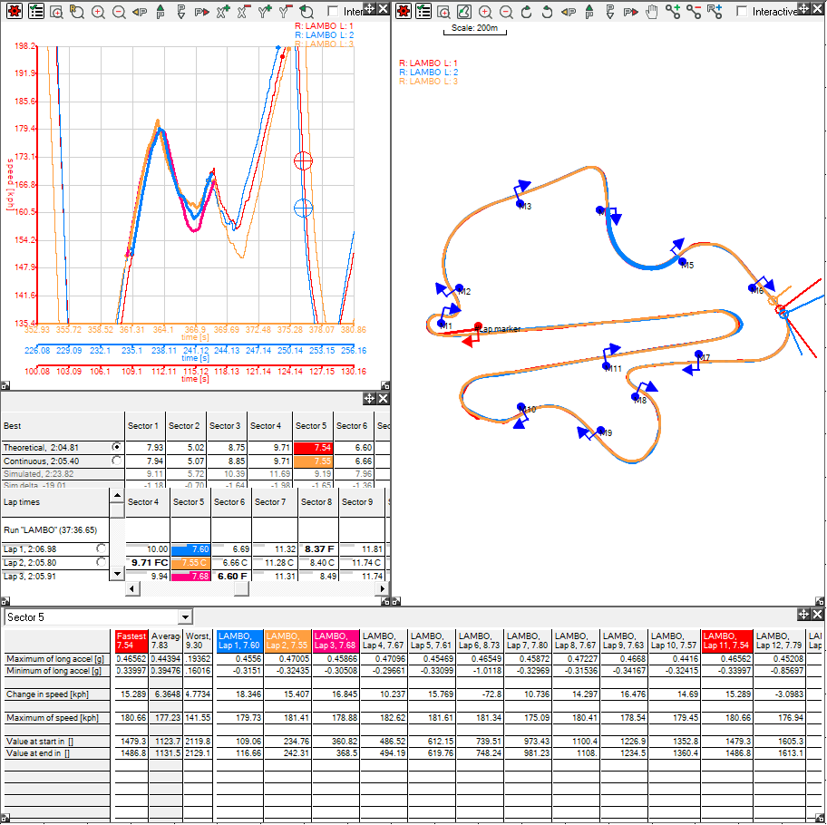
To highlight multiple sectors from the Summary Statistics window, select the sector you wish to look at from the drop down menu, in this case, Sector 5, and then click on the column headers for the laps you wish to view the sector for. Please note that the lap headers are on the right hand table of results, and as the eleventh lap was the fastest lap in terms of time it is highlighted in the same colour:
Note that the sector is colour co-ordinated on the Lap And Sector Times Table to match the colours on the Summary Statistics table, and the sector has been highlighted on both the Track Map and the XY Graph.