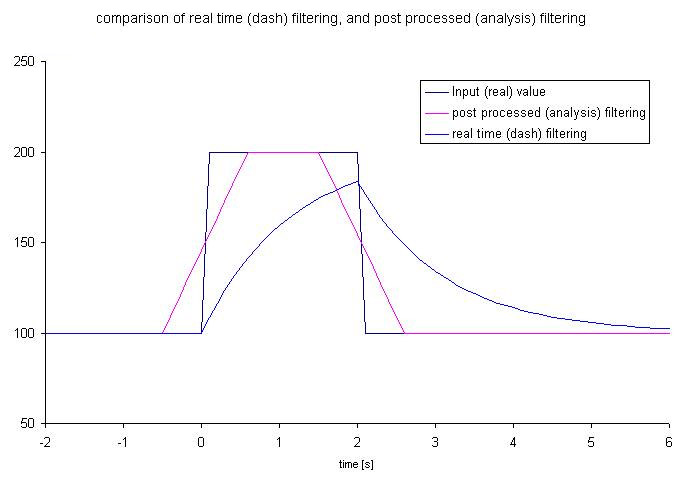
filtering on displays and analysis
The values displayed in analysis and on the dash board can be different when the input signal is changing due to the differences in the way that the filtering works.
In the case of analysis the filtering is done using the data before and after the data point to eliminate and delay (also called phase shift) of the data. Mathematically the filtering in analysis is done by averaging the data either side of the point, for example with filtering set to 1s, to calculate the value at time 1s the input data between 0.5s and 1.5s is averaged.
In the case of a dashboard, the filtering can only be based on the data up to that point in time. Mathematically the filter used is a first order type. The result is that the results are similar, but not the same.
If we look at the example in the graph above the input value goes from 100 to 200 at time=0. The graph plots the values that analysis and dash board would show. As can be seen from the graph, because of the different methods of filtering that are used the peak values are different. For this example this case the analysis result goes to 200, the dash board would display a maximum of 190, a 5% difference.

