|
Call me back |
|

You are here: Website » Knowledge base
|
RTAnalysisTools / XYGraph1. XY Graph
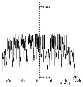
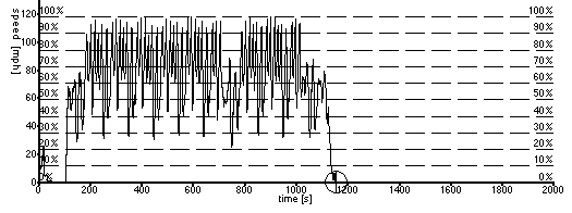
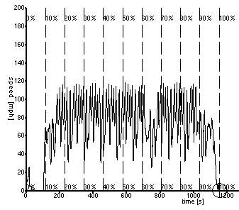
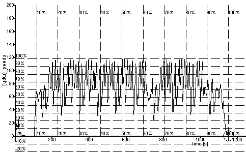
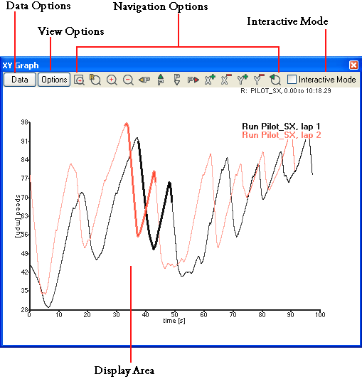 The XY Graph is a powerful tool for displaying and analysing data. The graphs are entirely flexible and can be used to display up to 5 different, totally independent graphs. Each graph can have it's own x and y axis variables and independent minimums and maximum. You can also pan and zoom freely. To open a new graph, go to the > Results > XY Graph or click on the To learn how to export from a graph to a spread sheet, click here. 1.1 Displaying DataThe first decision to be made when displaying a graph, is what data you want to display. You will need to choose a variable for the Y-Axis (vertical) and the X-Axis (horizontal). Once you have loaded a , you will be able to select it from the Data Options button. When you click the Data Options button, you will see the following menu: 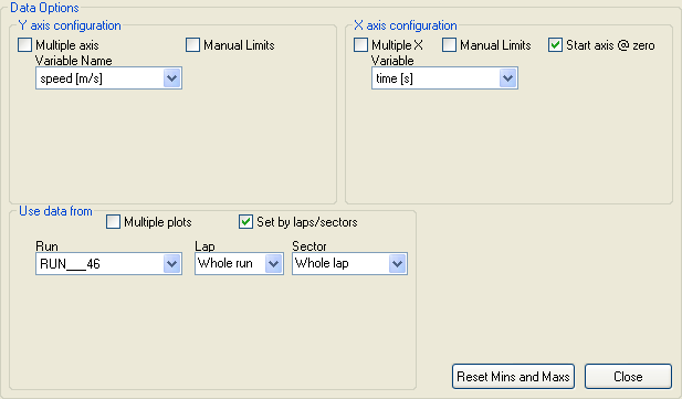 If you have more than one run loaded, you will be able to select it from the "Use data from" section. To choose the variable for the Y-Axis, select the variable you want to compare from the Variable Name list under the "Y axis configuration" section. To choose the variable from the X-Axis, choose the variable you wish to compare against from the Variable menu under "X axis configuration" section. To choose which part of the run you look at, make sure you have set up lap and track markers, then select which section you wish to look at from the drop down menus. Alternatively, if you've not got the lap and track markers set up, you can uncheck the "Set by laps/sectors" box and set which section of the entire run you look at by entering times into the boxes: 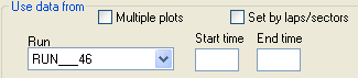 Once you've set up the variables you want to look at, click close and the graph you set up should be displayed. You can display up to 5 variables on each axis. You can have either 1 X- and 1 Y-axis, up to 5 X-axes against 1 Y-axis, 1 X-axis against up to 5 Y-axes or up to 5 XY Graphs displayed in the same space. When you select multiple Y-axes against one X-axis, the Y-axes will be colour coded to the traces drawn. The same goes for if you chose multiple X-axes against one Y-axis. The following graph shows two Y-axis against one X-axis:  To display multiple plots, i.e. display the same graph for several laps or sectors, go to the Data options and select "Multiple plots" from the "Use data from" section. When you select this, the Multiple Y Axis option will be checked automatically, you can uncheck this if you want to look at the same variable for the different sectors. To compare the speed for sector 5 of the first 4 laps, select Multiple plots, and uncheck Multiple axis for the Y side. Then select the laps and sectors you want to compare, and select speed and time for the Y- and X-axes respectively: 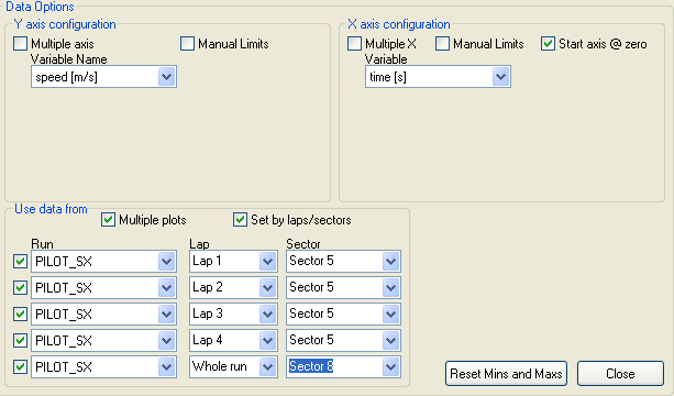 Unless you want to look at a specific range, you do not need to select Manual Data Limits. If you wish to use the time for from how far it is into the run, make sure that "Start axis from zero" is un-checked on the X-axis options, but please note that this will display all laps relative to the start of the run time, i.e. lap 1 will be drawn, then lap 2 etc, if you have selected the same sector on different laps, this will leave a gap between them. If you check this option, the graph will display 0 for the start of the highlighted/selected section(s) and they will overlap for comparison: 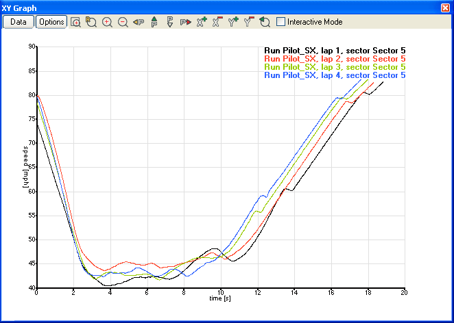 1.2 View OptionsThe View Options allow you to manipulate how the graphs are displayed: 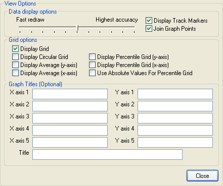
1.3 Zooming And Panning Controls Step Backwards - This steps back through any changes in the zoom you've done since you set up the graph, it will store up to 40 levels of undo. Step Backwards - This steps back through any changes in the zoom you've done since you set up the graph, it will store up to 40 levels of undo. Area Select Zoom - This allow you to zoom into an area you have highlighted by clicking and dragging with the mouse. Area Select Zoom - This allow you to zoom into an area you have highlighted by clicking and dragging with the mouse. Zoom Out - This zooms out on both axes by 20%. Zoom Out - This zooms out on both axes by 20%. Reset All Axis - This will change both axes to display the full data range. Reset All Axis - This will change both axes to display the full data range. Pan Left - Shifts the view of the graph to the left. Pan Left - Shifts the view of the graph to the left. Pan Upwards - Shifts the view of the graph upwards. Pan Upwards - Shifts the view of the graph upwards. Pan Downwards - Shifts the view of the graph downwards. Pan Downwards - Shifts the view of the graph downwards. Pan Right - Shifts the view of the graph downwards. Pan Right - Shifts the view of the graph downwards.1.4 Display Area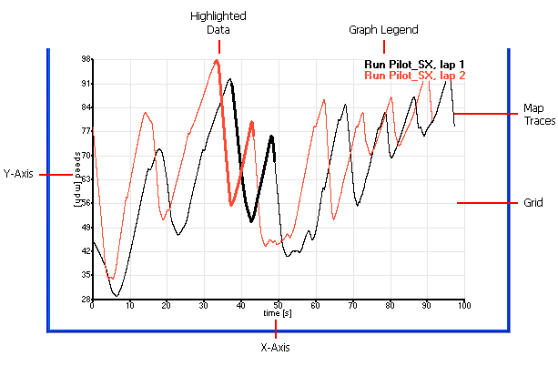
While the XY graph is a powerful tool for analysis, as all the data is displayed on the same area, if you choose to have multiple X- and Y-axes, then you will still only get 5 traces, one for each set of X- and Y-axes. If you wish to compare data for up to 5 sets of data, with up to 5 variables against distance or time etc. it is recommended you use the Quick XY Graph. 1.5 Printing GraphsTo learn how to print Graphs click on the following link: |
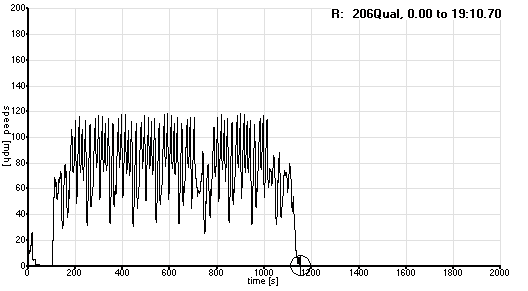
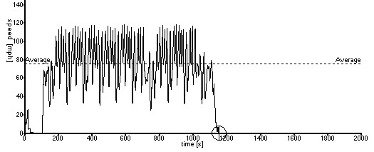
 button. When you open a new graph, it will initially display the speed against time for the whole of the first run you loaded, with any laps or sectors you have highlighted in the Laps And Sector Times table highlighted on the trace. If no are loaded, then no data will be displayed.