How do I see where I was gain/losing time on a lap ?
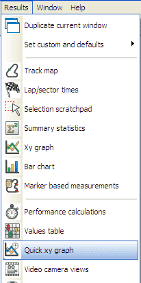
step 1: Enter the results menu at the top of the screen and select the "Quick XY Graph" option.
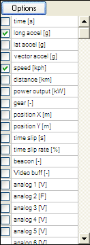
step 2: This will open up a "Quick Graph" window.
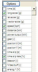
step 3: Select "time slip rate[%]" as one of your variables. Time slip shows the rate at which time is lost or gained from lap to lap. For example, if on your best lap you were travelling at a constant speed of one hundred mph, and on a subsequent lap you only travelled at ninety mph, then your time slip for that lap would be 10%.
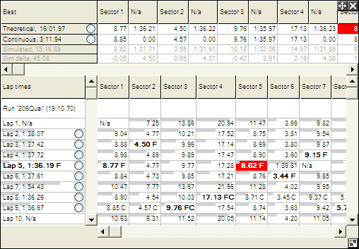
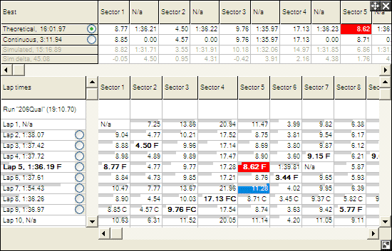
step 4: Select which lap or sector you wish to display on the "Lap and Sector Times" table.
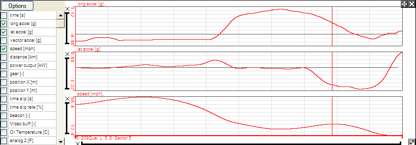
step 5: This will now be displayed on your Quick Graph. The best logged lap or sector is displayed as a straight line running horizontally across the graph. Where the data for the lap or sector that is being examined falls above this line, time was lost, where it falls below, it was gained.
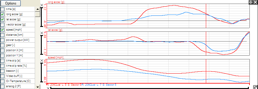
step 6: To compare more than one lap or sector, simply select the data that you wish to compare from the "Lap and Sector Times" table (no more than five laps or sectors may be selected at any one time - the more that are selected, the more difficult the comparison becomes).
step 7: The selected laps or sectors will now be displayed on the Quick Graph. The colours on the graph directly correspond to the colours of the highlighting on the "Lap and Sector Times" table.

